

The 7 Basic Quality Tools
Nov 18, 2014
1.56k likes | 2.48k Views
The 7 Basic Quality Tools. Michele Cano. Agenda. Introductions Basic Tools – Ishikawa Exercises Discussion & Video ………………….Lunch………………………. Problem solving (Global 8D and TRIZ) Case study Discussion. Why use tools?. Measure Improve. What are they?.
Share Presentation
- check sheet
- pareto chart
- effect diagram
- effect diagram consists
- production process distribution checks

Presentation Transcript
The 7 Basic Quality Tools Michele Cano
Agenda • Introductions • Basic Tools – Ishikawa • Exercises • Discussion & Video ………………….Lunch………………………. • Problem solving (Global 8D and TRIZ) • Case study • Discussion
Why use tools? • Measure • Improve
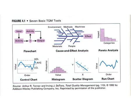
What are they? The seven basic tools according to Ishikawa are: • Check sheets • Flow charts • Graphs & Histograms • Pareto diagram • Cause and effect diagram • Scatter diagram • Control chart
1.Check sheets • What is a check sheet? • A form or sheet used to record data.
Function of Check Sheets According to Ishikawa 1982, check sheets have the following functions: • Production Process distribution checks • Defective item checks • Defective location checks • Defective cause checks • Check-up confirmation checks • Others
Example of a simple check sheet. (for car valet operation)
Example of a simple process check sheet. (attributes)
FlowchartsPROCESS MAPPING • Process mapping is an essential first step. • It identifies all of the process activities, sequence and responsibilities. • This can either be in a written format, or as a flowchart.
FlowchartsPROCESS MAPPING (Written format)
Flowcharting • Flowcharting is a graphical tool for analysing processes. • Constructing flowcharts leads to a better understanding of processes. • Better understanding of processes is a essential for improvement
FlowchartsSome standard symbols
Exercise Draw a flowchart for one of the following processes: • Making a cup of coffee • Enrolling students • Wiring a plug.
3. Graphs & Histograms Graphs, either presentational or mathematical are used to allow understanding and analysis of collected data sets.
GraphsBAR CHARTS • This is the data set totalled up and shown graphically. • It immediately identifies the major defects for all to see.
Graphs • The below graph shows a factory output for February. This time it shows specific dates which could be analysed.
Graphs • The graph below shows the major cause for customer complaint, the use of the pie chart and the colours enforce the message.
Rules for Graphing • Use Clear titles an indicate when the data was collected • Ensure the scales are clear, understandable and represent the data accurately. • When possible use symbols for extra data. • Always keep in mind the reason why the graph is being used.
Exercise Graphs • You are the marketing director of XZY automotive, a new Scottish company. You have organised a local survey to rate your car against other small cars. • 30 people were polled and the results are shown below. • Xzy, ka, Clio, Clio, ka, fiesta, xzy, ka, 206, xzy, fiesta, fiesta, xzy, polo, fiesta, 206, 206, polo, 206, fiesta, fiesta, fiesta, polo, xzy, polo, fiesta, xzy, xzy, ka, xzy. • You recognise the power that graphs produce. And you have decided to Graph the results as part of you marketing drive. Explain your choice of graph.
What is a Histogram? • The Histogram is a graphical representation of data that is a dimensional measurement of one feature.
What is a Histogram? • This is the computer defect data set totalled up and shown graphically, but is it a histogram?
What is a Histogram? • The answer to the previous question is NO • The Histogram is a graphical representation of data that, is a dimensional measurement of one feature.
When is a Histogram Used? • To look at one particular set of results • To check for patterns in a process • To examine large amounts of data
Histograms • The following data was collected when measuring the bow (warp) of a plastic component. The specification is 0 to 8 x10⁻³ mm. • At a glance this tells you very little, but it can be plotted as a histogram because we have quantities data with target limits.
6 5 4 3 Frequency 2 1 0 6 9 0 1 2 3 4 5 7 8 More Thou Histograms
What is a Histogram? Exercise • Sort the following data into appropriate sets, then plot them. • The limits are 3 volts ± 0.1 • What can you deduce from this?
What is a Histogram? Exercise
4. Pareto Analysis
ParetoWhat is Pareto Analysis? • Pareto analysis is a method for prioritising data. • It consists of a Bar Chart displayed either in order of frequency or relative cost.
Houshold repairs over the last 10 years Cost £ per Total cost Problem frequency occurance £ Light bulb fails 100 0.6 60 Broken central heating pump 1 190 190 Broken window 2 50 100 Leaking taps 16 2.5 40 Faulty central heating boiler 1 3000 3000 Leaking radiators 3 15 45 ParetoExample: The information to be represented on a Pareto diagram should already have been collected in some sort of record.
ParetoPareto Chart The data are then displayed graphically. Firstly in terms of frequency.....
Pareto ... and then by cost.
ExerciseParetoPlot the following data as a Pareto chart
6. Cause and Effect Diagrams (Ishikawa) A method for the identification of the root cause of a problem.
cause and effectWhat is Brainstorming? • A way to get creative ideas. • A way to get everyone’s views. • A way to generate alternatives.
cause and effectPotential Uses (Brainstorming) • For identifying areas for improvement. • For finding potential causes of problems. • For developing possible preventive actions.
Give wild and unusual ideas. Aim for quantity. Build on ideas of others. Encourage participation. Evaluate or criticise. Stop to soon. Allow domination or idea ownership. cause and effectSome Guidelines (Brainstorming) Do’s Don'ts
cause and effectRanking Ranking can be used after brainstorming to assess the teams Priority position on a list of ideas. The basic procedure is: • Each person privately selects 3 to 5 items from the list • Each person ranks their selection in order of priority • The marks are then totalled for each item • The item having the highest total is then judged to have the • highest priority
cause and effectWhat is a Cause and Effect Diagram? • The process of a cause and effect diagram consists of defining an effect in terms of possible causes and is normally carried out in the form of a Brainstorming session. • The principal causes are typically Man, Materials, Methods or Machines. • These are then reduced to sub-causes. • Finally, the most likely causes are then circled and are subject to future examination. • These relationships are displayed pictorially in the form of a fishbone structure.
cause and effectLayout: Method Man Sub-Cause Sub-Cause Sub-Cause Effect Sub-Cause Sub-Cause Sub-Cause Materials Machines
6. Scatter Diagrams A method for the identification the relationship (effect) between two factors (Causes).
Scatter diagramsWhat is it used for? • Validating "hunches" about a cause-and-effect relationship between two variables. • Displaying the direction of the relationship (positive, negative, etc.) • Displaying the strength of the relationship
Scatter diagramsConstructing scatter diagram • In order to construct a scatter diagram you need two variables to be plotted against each other. One on the x axis the other on the y axis. • The relationship is then plotted. Variable b relationship Variable a
Scatter diagramsConstructing scatter diagram • This process is continued, showing the effect of changes in one of the variables against the other variable. Variable b Variable a
Scatter diagramsInterpreting a scatter diagram • The diagram below shows a Strong Positive relationship between the variables (an in crease in a results in a positive increase in b, which is almost uniform.) Variable b Variable a
Scatter diagramsInterpreting a scatter diagram • The diagram below shows a Strong Negative relationship between the variables (an in crease in a results in a decrease in b, which is almost uniform.) Variable b Variable a
Scatter diagramsInterpreting a scatter diagram • The diagram below shows a Weak Positive relationship between the variables. Variable b Variable a
Scatter diagramsInterpreting a scatter diagram • The diagram below shows a Weak Negative relationship between the variables. Variable b Variable a
Scatter diagramsInterpreting a scatter diagram • The diagram below shows a that there is no relationship between the variables. Variable b Variable a
- More by User
Quality Tools
Quality Tools Table of Contents Quality techniques 7 Basic Quality techniques Histograms Pareto Charts Run Charts Scatter Diagrams Control Charts Flow Charts Cause and Effect Diagrams New techniques Other Tools Introduction
569 views • 19 slides

The Basic Seven (B7) Tools of Quality
The Basic Seven (B7) Tools of Quality. "As much as 95% of quality related problems in the factory can be solved with seven fundamental quantitative tools." - Kaoru Ishikawa. By Zaipul Anwar Business & Advanced Technology Centre, Universiti Teknologi Malaysia.
1.69k views • 69 slides

Unit #7 - Basic Quality Control for the Clinical Laboratory
Unit #7 - Basic Quality Control for the Clinical Laboratory. Cecile Sanders, M.Ed., MT(ASCP), CLS (NCA). Unit #7 - Basic Quality Control for the Clinical Laboratory. Introduction
997 views • 28 slides

Applying the Seven Basic Quality Tools in Software Development
Applying the Seven Basic Quality Tools in Software Development. Ishikawa’s Seven Basic Tools for Quality Control. Checklist (or Check Sheet) – to facilitate gathering data and to arrange data so it can be easily used later
836 views • 19 slides

The 7 Basic Quality Tools. Michele Cano. Agenda. Introductions The 7 Basic Tools Exercises Break The 7 Basic Tools continued Exercises Group Discussions. What are they?. The seven basic tools according to Ishikawa are: Check sheets Flow charts Graphs & Histograms Pareto diagram
1.03k views • 72 slides
The Basic Tools
The Basic Tools. CSSE 514 Programming Methods 4/26/01. Overview. Plain Text The Command Shell Editors Source Code Control Debugging Text Manipulation Code Generators References: Andrew Hunt, David Thomas, The Pragmatic Programmer , Addison Wesley, 2000
354 views • 21 slides

THE BASIC TOOLS OF FINANCE
388 views • 36 slides
Quality Tools. Table of Contents. Quality techniques 7 Basic Quality techniques Histograms Pareto Charts Run Charts Scatter Diagrams Control Charts Flow Charts Cause and Effect Diagrams New techniques Other Tools. Introduction.
530 views • 19 slides

Quality Tools. ISQA 552 MBA Mellie Pullman. Quality Specifications. Design quality : Inherent value of the product in the marketplace Dimensions include: Performance, Features, Reliability, Durability, Serviceability, Response, Aesthetics, and Reputation.
831 views • 42 slides

Chapter 2 Basic Tools for Improving Quality
Chapter 2 Basic Tools for Improving Quality. 7 Basic Tools by Ishikawa. Histogram Pareto chart Scatter plot Control chart Cheek sheet Cause-and-effect diagram Defect concentration diagram. 2.1 Histogram.
586 views • 36 slides

The Philosophers Toolkit Basic Tools
The Philosophers Toolkit Basic Tools. Reflection. ?. Reasoning. Questioning. Clarifying. Distinctions. When necessary distinction may need to be spelt out when undertaking discussions so that the participants understand the uses and limitations of key terms.
321 views • 14 slides

The Basic Seven (B7) Tools of Quality. A PowerPoint Training Presentation By Keith H. Cooper "As much as 95% of quality related problems in the factory can be solved with seven fundamental quantitative tools." - Kaoru Ishikawa. What are the Basic Seven Tools of Quality?. Fishbone Diagrams
1.44k views • 38 slides
The Basic Tools. Presented by: Robert E., & Jonathan Chase. The Power of Plain Text. What is it? Printable characters in a form that can be read directly by people Can be structured (xml, html) Possible to achieve self-describing data stream independent of its creator. Plain Text (cont.).
333 views • 16 slides
Chapter 7 Quality Tools
Chapter 7 Quality Tools. Which tool is best?. Tools can serve as the backbone for virtually any type of quality improvement effort (Six Sigma, TQM, 8D) Graphical representations of data help us understand the true importance of data.
1.01k views • 59 slides
QUALITY TOOLS
QUALITY TOOLS. Table of Contents. Quality techniques 7 Basic Quality techniques Histograms Pareto Charts Run Charts Scatter Diagrams Control Charts Flow Charts Cause and Effect Diagrams New techniques Other Tools. Introduction.
724 views • 41 slides
The Seven (or so) Basic Quality Tools
The Seven (or so) Basic Quality Tools. Presented by Mike La Dolcetta ASQ Sr. Member, CQM, CSSGB. History and Introduction.
773 views • 13 slides
Quality Tools. Plan. Act. Do. Study. The PDSA Cycle. Select a process. Document. Study/document. Evaluate. Seek ways to Improve it. Implement the Improved process. Design an Improved process. The Process Improvement Cycle. Process Improvement Tools.
1.54k views • 124 slides

Quality Tools. Key Contributors to Quality Management. Key Contributors to Quality Management. Total Quality Management. A philosophy that involves everyone in an organization in a continual effort to improve quality and achieve customer satisfaction. Process Improvement.
819 views • 52 slides

Chapter 2 Basic Tools for Improving Quality. 7 Basic Tools by Ishikawa. Histogram Pareto chart Scatter plot Control chart Cheek sheet Cause-and-effect diagram Defect concentration diagram. 2.1 Histogram. Table 2.1 Example Data. Histogram by Minitab. Histogram by Excel.
506 views • 36 slides
The Seven Basic Tools of Quality
About 3FOLD • Established in 2008 • Branches in Abu Dhabi, Dubai and Doha • Approved by KHDA, PMI, AACE, ASQ, IMA and AACE • The most economical institute for the official ASQ trainings in UAE
463 views • 37 slides

- My presentations
Auth with social network:
Download presentation
We think you have liked this presentation. If you wish to download it, please recommend it to your friends in any social system. Share buttons are a little bit lower. Thank you!
Presentation is loading. Please wait.
Quality Improvement: Problem Solving Quality Tools and Techniques.
Published by Gerald Palmer Modified over 9 years ago
Similar presentations
Presentation on theme: "Quality Improvement: Problem Solving Quality Tools and Techniques."— Presentation transcript:

Quality Improvement: Problem Solving

CAUSE & EFFECT DIAGRAM (Fishbone or Ishikawa Diagram) Dr
Seven Quality Tools The Seven Tools
ISHIKAWA DIAGRAM – Tool for quality management Marit Laos IS Project Management

Chapter 8: Project Quality Management
Flow charting symbols CHECK SHEETS Check sheets explore what and where an event of interest is occurring. Attribute Check Sheet Order Types 7am-9am 9am-11am.
Tools of quality control A-Team. Basic tools of quality control control chart histogram Pareto chart check sheet cause-and-effect diagram

Chapter 3 Quality Management
Statistical Process Contol (SPC)

To Accompany Russell and Taylor, Operations Management, 4th Edition, 2003 Prentice-Hall, Inc. All rights reserved. Quality Management OPIM 310-Lecture.
Copyright 2006 John Wiley & Sons, Inc. Beni Asllani University of Tennessee at Chattanooga Operations Management - 5 th Edition Chapter 2 Roberta Russell.

Hilton Maher Selto 7 Managing Quality and Time to Create Value McGraw-Hill/Irwin © 2003 The McGraw-Hill Companies, Inc., All Rights Reserved.
Part Three TQM – The Tools and the Improvement Cycle

Chapter 14 Quality Management Sell good merchandise at a reasonable profit, treat your customers like human beings, and they will always come back for.
Roberta Russell & Bernard W. Taylor, III
TOTAL QUALITY MANAGEMENT (Continuous Quality Improvement)

Total Quality Management

Chapter 2 Basic Tools for Improving Quality. 7 Basic Tools by Ishikawa Histogram Pareto chart Scatter plot Control chart Cheek sheet Cause-and-effect.

ISHIKAWA’S BASIC SEVEN TOOLS OF QUALITY

1 Presented by: Dr. Husam Arman Quality management: Tools and Techniques.
About project
© 2024 SlidePlayer.com Inc. All rights reserved.

IMAGES